
Colour palette guide — Australian interiors
Practical palettes and contrast guidance for living rooms, kitchens and bedrooms across Australia — with sustainable pairings and room-specific notes.

Our palettes balance daylight, coastal influences, and practical finishes for Australian homes.
Core palettes
Coastal Neutrals
Soft sands, pale blues, and warm whites for relaxed coastal homes.

Urban Warmth
Terracotta, muted greens and warm timber tones for inner-city apartments.
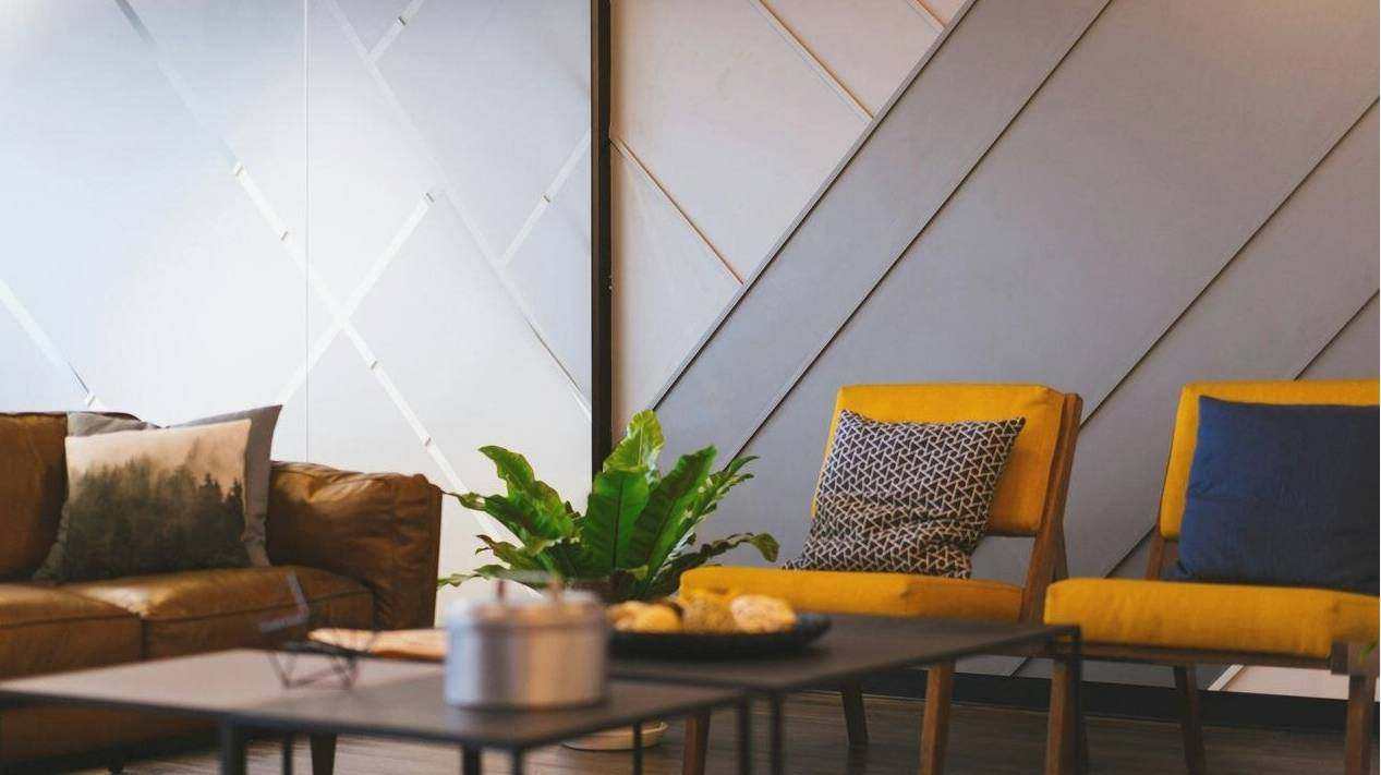
Minimal Modern
High-contrast neutrals with cool accents for clean, contemporary interiors.
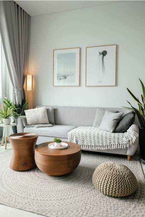
Materials & finishes
Sustainable pairings
Use low-VOC paints, FSC timber, and recycled textiles to keep palettes rich but responsible.
- Matt paints reduce glare in bright Australian rooms
- Timber tones warm cool palettes without heavy colour
- Textured neutrals add depth on small budgets
Finish advice
| Space | Preferred finish | Reason |
|---|---|---|
| Kitchen | Eggshell / Semi-gloss | Durability & wipeability |
| Living | Matt | Comfortable feel, hides imperfections |
| Bathroom | Semi-gloss | Moisture resistance |
Room examples
Living room — Coastal Neutrals
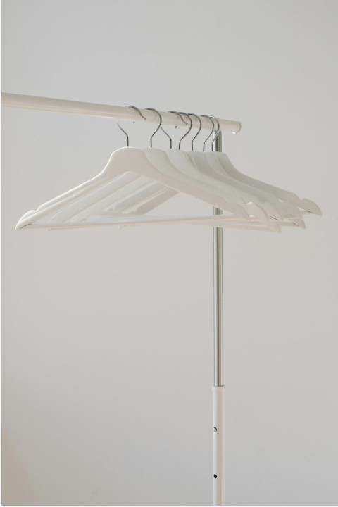
Light curtains, pale timber floors, and a muted blue sofa keep the room airy and resilient to Australian sun.
Bedroom — Urban Warmth

Layered textiles in terracotta and soft green bring depth while maintaining a calm bedroom mood.
Swatches & downloadable assets
Grab printable swatches or share a palette with your contractor. Palettes are optimised for common Australian lighting conditions.